Education Website Analytics & Optimization
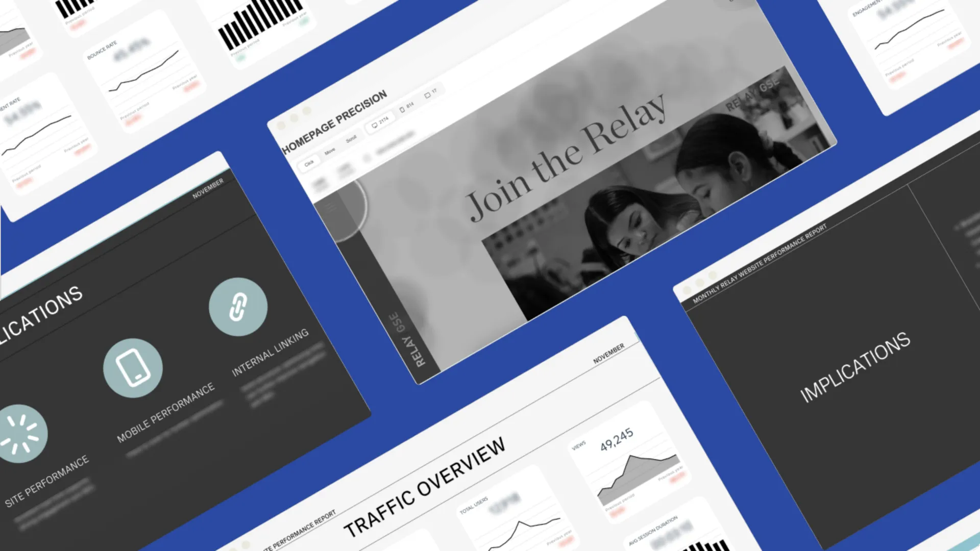
Project Background
Relay Graduate School of Education sought to refine its website and digital strategy to better serve its diverse audience, including school districts and prospective students. While known for its strong network and impactful programs, the site struggled with unclear navigation and content alignment, making it difficult to meet stakeholders' needs. Facing challenges in user engagement and lead generation, Relay turned to data-driven analysis to identify improvement areas and optimize its digital presence.
Key Performance Indicator of my project
This is the impact of the project, shown in real numbers.
User Engagement
Based on heatmap and funnel analysis, recommendations were made to optimize user flow
Lead Generation
By analyzing the user journey, the recommendations aimed to streamline the experience by addressing friction points.
Website Navigation
By analyzing website navigation, the recommendations focused on simplifying the structure and improving user flow.
Traffic Sources Analysis & SEO
To lay the groundwork for understanding user behavior, I begin by segmenting the audience based on their traffic sources and analyzing how each group interacts with the website. Using tools like Google Analytics for traffic breakdowns and SEMrush for keyword research, I assess the performance of different channels. I also benchmark these findings against industry standards and competitors using platforms like SimilarWeb and SEMrush.
For this project, I identified that direct and organic traffic were the primary sources, which aligns with industry norms. A significant volume of direct traffic often raises concerns about tracking discrepancies. However, a deeper analysis of landing pages revealed that the majority of this traffic was from returning users accessing their accounts—an expected and healthy trend.
Referral traffic analysis further uncovered insights about a specific user segment that warranted closer attention. Organic traffic, which showed higher engagement rates, emerged as a key opportunity for optimization. Competitor benchmarking revealed a gap: while none of the main competitors had strong organic strategies, this channel had clear potential to drive growth. By identifying high-potential topics and keywords, I outlined opportunities for SEO improvements that could provide a competitive edge.
To ensure ongoing monitoring and actionable reporting, I usually create custom dashboards using tools like Google Looker Studio or DashThis. For this project, I utilized DashThis to enable key stakeholders to track performance over time, measure the impact of strategic decisions, and adjust tactics as necessary.
User Behavior on Site & User Flows
Understanding how users navigate through a website is essential for identifying friction points and areas for optimization. For this project, I utilized tools like heatmaps, screen recordings, and funnel analysis to gain detailed insights into user behavior. These methods allowed me to observe where users clicked, how they scrolled, and where they dropped off during key processes, such as signing up or exploring content.
By analyzing user flows, I identified patterns and potential obstacles in navigation. For instance, certain pages with critical information were receiving less engagement than expected due to unclear call-to-actions or overly complex pathways. Additionally, drop-offs in the sign-up funnel revealed opportunities to streamline the process and reduce user frustration.
I also analyzed the site’s top-performing pages to understand why they were successful and what this revealed about user interests and behavior. This analysis helped identify the content and layouts that resonated most with users, providing a model for optimizing underperforming pages.
The analysis also revealed that the menu served as the primary navigation tool for most users. However, the site’s vast amount of content and diverse program offerings, coupled with the absence of a site search feature, often made it challenging for users to find what they needed. This highlighted the need for improved navigation and content organization.
Based on these insights, I provided recommendations to optimize the site’s navigation and taxonomy to ensure users could access relevant information more intuitively. Additionally, I suggested introducing a robust site search feature, including exploring AI-powered solutions, to enhance discoverability. Finally, I proposed the development of an interactive program-finding tool to help users quickly locate programs suited to their needs. These suggestions were presented in actionable reports, providing clear guidance for improving the user experience.
Exits & Understanding Why
Examining where users exit the website is essential for identifying pain points and understanding why users might leave without completing desired actions. For this project, I focused on analyzing exit rates across key pages and user flows to uncover areas of improvement.
The analysis revealed that while the site provided extensive information, users often struggled to navigate it effectively due to unclear next steps and overwhelming program details. This was particularly true for prospective users exploring program options. The programs’ naming conventions and varied criteria made it challenging for early-stage users to discern which program suited their needs without speaking to someone directly.
Critical pages featured CTAs prompting users to contact the team for assistance, but these were rarely utilized, as indicated by site statistics. This highlighted potential issues, such as users not feeling ready to engage at this stage of their journey or the CTAs themselves being ineffective due to suboptimal placement or unclear wording.
Other factors contributing to exits included an overwhelming amount of information presented without sufficient guidance, as well as non-intuitive layouts that hindered users from exploring related content or taking the next step.
Based on these findings, I recommended several improvements: refining navigation and program taxonomy to simplify content discovery, introducing an interactive program-finding tool to guide users based on their preferences, and optimizing CTAs by adjusting their placement and wording to better align with user intent. These recommendations aimed to reduce friction, address pain points, and create a more intuitive experience for users at every stage of their journey.
Other Projects
E.S. Kluft Website Redesign
Array UX Design
Subscription Box Product Design
Web Analytics & UX Strategy for a luxury bedding brand
Fashion eCommerce Strategy and Product Management